<!-- This file contains many elements adapted from the online tutoral -->
<!-- on Bootstrap 4 as found here: https://www.w3schools.com/bootstrap4/default.asp -->

<!-- Images source: -->
<!-- jule.jpg taken from https://www.freepik.com/premium-vector/cartoon-successful-hairdresser_3951066.htm -->
<!-- Erwind.jpb https://www.kijiji.ca/v-construction-trades-jobs/winnipeg/bicycle-mechanic/1499188319 -->

<!DOCTYPE html>
<html lang="en">

<!-- The head should contain an appropriate title for your site -->
<head>
    <title>Module 4 - Labo</title>
    <meta charset="UTF-8">
    <meta name="viewport" content="width=device-width, initial-scale=1">

    <!-- Style sheet (CSS) and JavaScript scripts necessary to use Bootstrap -->
    <link rel="stylesheet" href="https://maxcdn.bootstrapcdn.com/bootstrap/4.5.0/css/bootstrap.min.css">
    <script src="https://ajax.googleapis.com/ajax/libs/jquery/3.5.1/jquery.min.js"></script>
    <script src="https://cdnjs.cloudflare.com/ajax/libs/popper.js/1.16.0/umd/popper.min.js"></script>
    <script src="https://maxcdn.bootstrapcdn.com/bootstrap/4.5.0/js/bootstrap.min.js"></script>    

    <!-- Your own additional style sheet -->
    <link href="styles/style.css" rel="stylesheet" type="text/css">
</head>


<body>

    <!-- Medium size container, padding 3, margins 3, background dark, text is white -->
    <!-- Should show the name of your company with an image or logo -->
    <!-- Bootstrap has its own font for H1, H2, p, etc.  -->
    <!-- Look in BS4 Typography https://www.w3schools.com/bootstrap4/bootstrap_typography.asp -->
    <!-- Use your own CSS file to change those fonts if they do not correspond to your company's look -->
    <div class="container-md p-3 my-3 border bg-dark text-white">
        <h1>Welcome to Nice Scissors</h1>
        <p>We'll take care of your hair!</p>
    </div>

    <!-- Bootstrap contains a grid system you can explore https://www.w3schools.com/bootstrap4/bootstrap_grid_system.asp -->
    <!-- It can be useful for placement of information -->
    <div class="row p-3">
        <div class="col-sm-3 pl-5">Service</div>
        <div class="col-sm-3">Calendar</div>
        <div class="col-sm-3">Payment</div>
        <div class="col-sm-3">Where to find us</div>
    </div>

    <!-- When you have messages to tell, remember that center align is not always the best choice -->
    <div class="container-md p-3 my-3 border bg-light text-success">
        <h3>Let us tell you about our expertise</h3>
        <p>We can <mark>cut hair</mark></p>
        <p class="text-center" >Align wheels</p>
        <p class="text-uppercase">Write in uppercase</p>
        <p class="text-center text-uppercase" >centered and uppercase</p>
    </div>


    <!-- Bootstrap has different types of tables https://www.w3schools.com/bootstrap4/bootstrap_tables.asp -->
    <!-- Might be (or not) useful to show some information to the user -->
    <div class="container">
        <h2>Service description</h2>
        <p>Here is a list of services offered</p>            
        <table class="table table-primary table-hover">
            <thead>
            <tr>
                <th>Service</th>
                <th>Description</th>
            </tr>
            </thead>
            <tbody>
            <tr>
                <td>Haircut</td>
                <td>Bla bla</td>
            </tr>
            <tr>
                <td>Drying</td>
                <td>Bla bla</td>
            </tr>
            <tr>
                <td>Coloring</td>
                <td>Bla bla</td>
            </tr>
            </tbody>
        </table>
    </div>


    <!-- Bootstrap has components for alerts: https://www.w3schools.com/bootstrap4/bootstrap_alerts.asp  -->
    <!-- These can be useful for making sure someone reads something before continuing -->
    <div class="container">
        <h2>Alert</h2>
        <p>We have something important to say</p>
        <div class="alert alert-danger alert-dismissible">
            <button type="button" class="close" data-dismiss="alert">&times;</button>
            <strong>Please read! </strong>You must read.
        </div>
    </div>

    <!-- You'll certainly need buttons at some point in your site -->
    <!-- https://www.w3schools.com/bootstrap4/bootstrap_buttons.asp -->
    <!-- Remember how we talked about choosing a hue and changing the saturation for active/inactive -->
    <!-- This idea is already part of the components in Bootstrap -->
    <div class="container">
        <h2>Button States</h2>
        <button type="button" class="btn btn-warning">Primary Button</button>
        <button type="button" class="btn btn-warning active">Active Primary</button>
        <button type="button" class="btn btn-warning" disabled>Disabled Primary</button>
    </div>


    <!-- Including a modal https://www.w3schools.com/bootstrap4/bootstrap_modal.asp -->
    <!-- Modals are useful for additional information or questions -->
    <!-- Here the modal is used for a little survey -->
    <div class="container">
        <h2>Modal Example</h2>
        <!-- Trigger the modal with a button -->
        <button type="button" class="btn btn-info btn-lg" data-toggle="modal" data-target="#mySurvey">Open Survey</button>
          
        <!-- Modal -->
        <div class="modal fade" id="mySurvey" role="dialog">
            <div class="modal-dialog">  
            <!-- Modal content-->
            <div class="modal-content">
                <div class="modal-header">
                    <button type="button" class="close" data-dismiss="modal">&times;</button>
                </div>
                <div class="modal-body">
                    <div class="container">
                        <h2>How did you hear about us?</h2>
                        <p>Tell us:</p>
                        <form>
                          <div class="checkbox">
                            <label><input type="checkbox" value="">Option 1</label>
                          </div>
                          <div class="checkbox">
                            <label><input type="checkbox" value="">Option 2</label>
                          </div>
                        </form>
                    </div>
                </div>
                <div class="modal-footer">
                    <button type="button" class="btn btn-default" data-dismiss="modal">Close</button>
                </div>
            </div>     
        </div>
        </div>    
    </div>

    <!-- Presenting the staff with cards: https://www.w3schools.com/bootstrap4/bootstrap_cards.asp -->
    <!-- Card columns allows multiple cards next to each other -->
    <!-- The first card's button doesn't go anywhere, it could be a modal --> 
    <!-- My second card limits the information seen and uses collapsible to show more -->
    <div class="container p-3">
        <h2>Meet our hairdressers</h2>
        <div class="card-columns">
            <div class="card bg-warning" style="width:200px">
                <img class="card-img-top" src="images/Jule.jpg" alt="Card image" style="width:100%">
                <div class="card-body">
                    <h4 class="card-title">Jules</h4>
                    <p class="card-text">Jules has been cutting hair for 10 years.</p>
                    <a href="#" class="btn btn-primary">See Profile</a>
                </div>
            </div>
            <div class="card bg-danger" style="width:200px">
                <img class="card-img-top" src="images/Jule.jpg" alt="Card image" style="width:100%">
                <div class="card-body">
                    <h4 class="card-title">Jules</h4>
                    <p class="card-text">The curly hair specialist</p>
                    <!-- collapsible part -->
                    <a href="#profile" class="btn btn-primary" data-toggle="collapse">See Profile</a>
                    <div id="profile" class="collapse p-3">
                        <p>Jules has been cutting hair for 10 years ... </p>
                    </div>
                </div>
            </div>
        </div>
    </div>


    <!-- A different approach would be to make the whole staff information collapsible -->
    <!-- Here a block button (taking the full width) opens/closes the collapsible -->
    <!-- Here a single card is used, but card columns could be used -->
    <div class="container">
        <h2>More information</h2>
        <a href="#mechanics" class="btn btn-primary btn-block" data-toggle="collapse">Meet our mechanics</a>
        <div id="mechanics" class="collapse">
            <div class="card bg-warning" style="width:200px">
                <img class="card-img-top" src="images/Erwind.jpg" alt="Card image" style="width:100%">
                <div class="card-body">
                    <h4 class="card-title">Erwind</h4>
                    <p class="card-text">Erwind knows all about bikes.</p>
                </div>
            </div>
        </div>
    </div>

    <!-- Collapsible with multiple items - accordion -->
    <!-- https://www.w3schools.com/bootstrap4/bootstrap_collapse.asp -->
    <!-- As we want to do a vertical navigation better suited for mobile design, an accordion pattern -->
    <!-- could work well.  You can use other patterns too.  This is just an example. -->
    <div class="container">
        <div class="container-md p-3 my-3 border bg-warning text-white">
            <h1>Erwind's and friends bike shop</h1>
            <p>
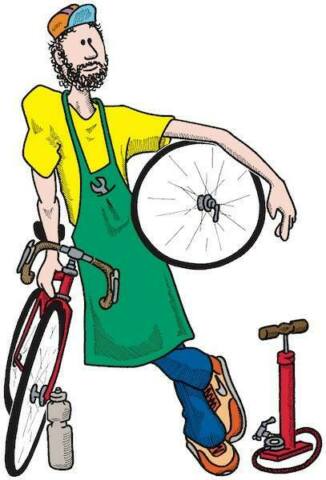
Bike fixing is our business</p>
        </div>
        <div id="accordion">
            <div class="card">
                <div class="card-header">
                    <a class="card-link" data-toggle="collapse" href="#collapseService">Choose a service</a>
                </div>
                <div id="collapseService" class="collapse show" data-parent="#accordion">
                    <div class="card-body">
                        <p>Here is our list of services</p>
                    </div>
                </div>
            <div class="card">
                <div class="card-header">
                    <a class="collapsed card-link" data-toggle="collapse" href="#collapseDate">Choose a date</a>
                </div>
                <div id="collapseDate" class="collapse" data-parent="#accordion">
                    <div class="card-body">
                        <p>What date?</p>
                        <!-- Bootstrap has various input components. Some examples are given here: -->
                        <!-- Component shown here: https://v4-alpha.getbootstrap.com/components/forms/#textual-inputs -->
                        <div class="form-group row">
                            <label for="dateTimeInput" class="col-2 col-form-label">Date and time</label>
                            <div class="col-10">
                                <input class="form-control" type="datetime-local" value="2011-08-19T13:45:00" id="dateTimeInput">
                            </div>
                        </div>
                    </div>
                </div>
            </div>
            <div class="card">
                <div class="card-header">
                    <a class="collapsed card-link" data-toggle="collapse" href="#collapseClientInfo">Your info</a>
                </div>
                <div id="collapseClientInfo" class="collapse" data-parent="#accordion">
                    <div class="card-body">
                        <p>Your information so we can contact you</p>
                        <p>Form to enter name, email, phone</p>
                    </div>
                </div>
            </div>
        </div>
    </div>

</body>
</html>